The pandemic has caught many of us off-guard. Brands and retailers were forced to shift their facade almost entirely online. In the past year, we have also received an increase of website-related requests from brand website revamp, microsites, e-commerce, loyalty apps, to migrating a physical cultural community online. The chain of events has indeed pressured brands to be more future-proof, and agencies to amp up their website design and development arms further.
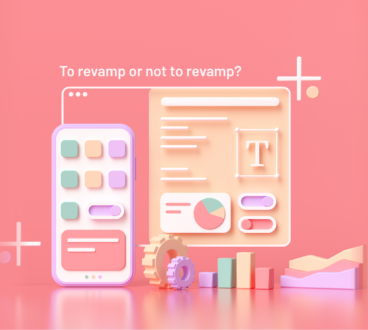
If the pandemic did not happen (therefore no obvious reasons as to why a brand needs a site revamp), would many still consider to upgrade their digital facade last year?
You don’t need to wait for an unfortunate event to hit you before you consider a website overhaul. After all, we’re living in an era where brands coexist with our daily online (and social) lives.
But, one might wonder… what are the signs? Just because another year has unfolded, does that mean we need one?
Here’s a crucial checklist to see if your website is due for a tune-up!
 You might have developed a new brand identity, a change of logo, colour palette, visual themes, styling, company manifesto, and many more.
You might have a new brand portfolio under your wing that requires you to explain more of it online.
Your target audience might have changed/ expanded. A website that’s targeting youth 3 years ago, for example, might lose its appeal to the current generation of youth.
Whether the change on your brand is visual-related, personality-related, product-related or people-related, your website should always be reflective of your brand.
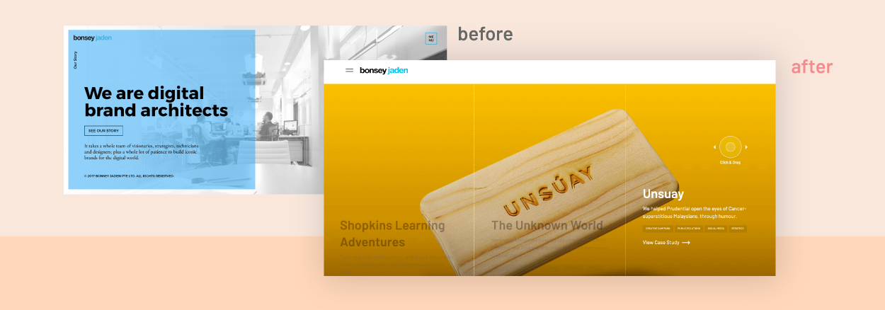
image: We started with our website looking white, blue and black. While the site was neat and everything was according to the brand colour, the previous site did not fully express our creative flair in building #PowerBrands. The website revamps addressed this by injecting more colours and interactive elements to emphasise the work that we’ve done.

Is your site mobile-friendly or mobile responsive? In the previous article, we’ve covered everything about responsive. A responsive website reacts with the user in mind and enhances usability no matter what the device is. On the other hand, mobile-friendly designs do not change based on the device being used – it functions the exact same way regardless of the device.
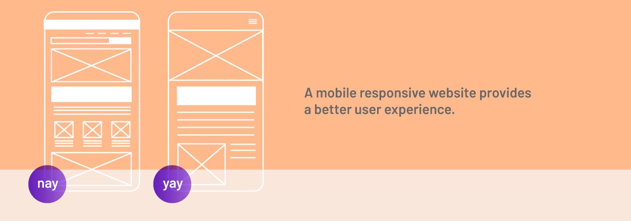
image: Making your website accessible on mobile is not enough – a mobile responsive website helps the user have a better user experience tailored and unique to the small devices.
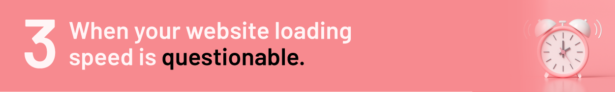
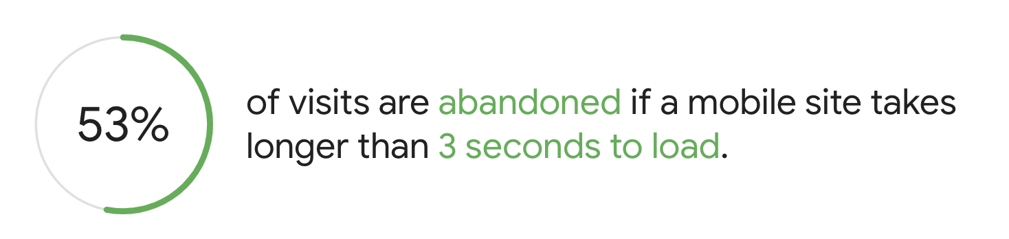
image: thinkwithgoogle
No one likes to wait – and when it comes to online sites, users have very little patience to slow websites. Even if it’s just a second difference. Google and other search engines also take site loading speed seriously and penalize sites that load slowly – they even released a self-analysis tool to educate site owners on the importance of speed.
There are certainly more than one way to improve site loading speed – some might involve a design and technology overhaul (especially if you’re using dated tech and you’re moving to adopt PWAs), or minor fixes like improving your SEO. If you’re unsure which one is right for your site, talk to an expert!
 If you find yourself requiring technical support just to change an image into your site, it’s a warning sign you shouldn’t ignore.

In today’s world where rich content is king, your website should not remain stagnant throughout the year (or years). Consider having a content management system like WordPress or Drupal to easily manage your content yourself.
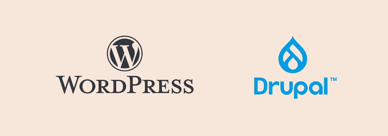
image: WordPress and Drupal are two of the popular choices in the Content Management System. When you work with us, we’ll assess each CMS providers and gives you a breakdown comparison to help you determine the best choice for you to manage your site.

Have you ever tried to search for something and it leads you to an error page? Or hoping to click ‘submit’ yet the button doesn’t work?
Broken elements
A broken experience frustrates user and drives them away from your page. Brands should not ignore broken links, broken forms, or even broken pages that linger on their sites. However, some brands take the opportunity to design error pages to help user bounce back to view more pages.
View this post on Instagram
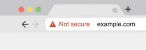
Make sure your site meets the safe browsing guideline
Another thing to note is to ensure your website abides by safe-browsing guideline. You don’t want the user’s browser to stop them from viewing your site.
When a competitor’s website is more updated (be it design, content, and responsiveness), it might be a wake-up call to revisit your website again. Watch out for UI/UX trends to keep your website in check and ensure it stays relevant.
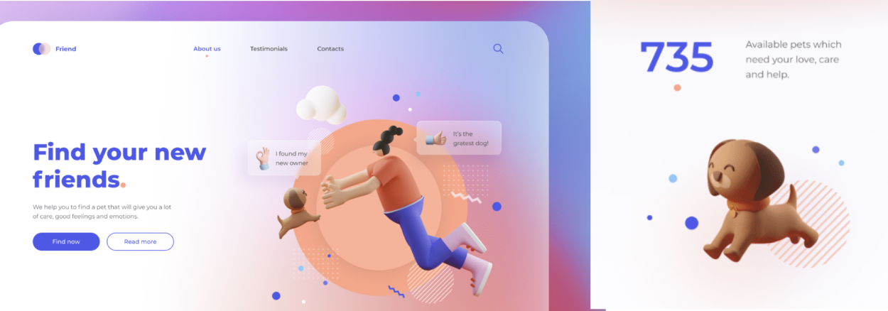
We’ll see more sites in 2021 adapting the glassmorphism and 3D illustration style. image: Christine Kirnis, Behance.
Conclusion
The 6-steps analysis above is a basic guide to help you gauge whether or not your website needs a design or technology upgrade. There can be more assessment criteria depending on a project-by-project basis. If you’re interested to know more, drop us a message anytime!