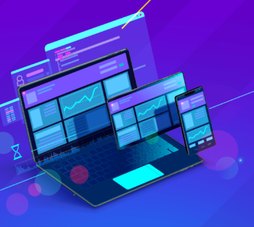
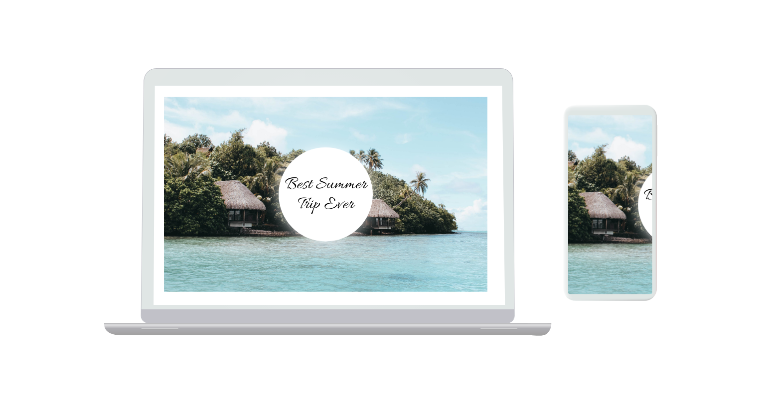
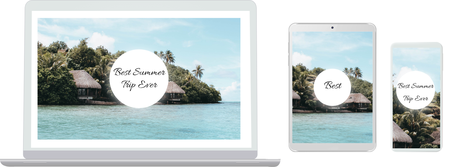
Responsive web design is a design approach that makes websites and all pages display on all devices in any possible sizes or resolutions as it might be laptops, desktop computers, tablets, or smartphones. By designing responsive websites, your website or all included pages can be adapted with the best experience for your users, and it does not matter what kind of devices or displays they are using!
Responsive design works via CSS (Cascading Style Sheet), using various settings with different styles. This depends on screen sizes as well as resolution, colour capability, and other user’s screen behaviour.
What Is The Best Size?
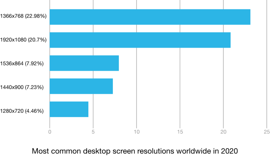
The majority of web designers and developers agree that optimisation of a design for the most popular resolution with audiences is the most practical way to do so. To define this easier, we have different available resolutions.
In early 2012, most of the users start using a screen resolution of 1344 x 768 (landscape), 769×1366 (portrait), or 1280×800. This has been changed to prove that optimal resolution sizes could change quickly for responsive web design.
The designer should design a website at least optimised for 1024×768 which should look good on most resolutions and devices. Still and all, this could cause some problems with mobile device screens. This is the time that web designers should know their users and design especially for them.
However, in some cases where designers don’t know a particular audience but not want to limit the design for a precise resolution, let’s look at a few best practices for different screens and web design.
Responsive Grids: How to Use Them
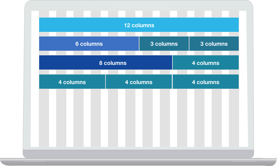
We can easily find that in the most modern and neat web designs, designers use grids as each element lines up nicely divided within each row. By using grids, the amount of each element’s padding to the other one is consistent and the outward edges have the exact same width, which makes the design very friendly to follow by user’s eyes.
On mobile, where designs tend to be more simple than desktops/laptops, designers need to align all elements with less trouble and difficulties. It should be well prioritised to make the elements ordering decisions. For example, if we have a “read more” button or hyperlink, web designers should stack that right after the main content.
A 12 column grid is the most common framework for designers and developers to divide all screens into 12 equal columns. These 12 are flexible by the designer’s decisions and could be 1 to 12 on different web pages, elements could sit in a row with neat alignments base on the number of columns they use as below. In a different row, we could have an unalike number of columns.
The SVG Solution
Quality of bitmap images could be a problem for different resolutions. These bitmaps are usually used for icons (app and notifications), and background images. Designers usually export all these assets in the highest resolution to making sure of visual qualities in different screen sizes. This is not the best way to present visuals because of file size and difficulties of aligning into different sizes.
Things have changed in design assets when SVG came on board. SVGs are “density-independent” unlike bitmaps (jpg, png, bitmaps and etc.), as they can be in any size with the same quality on any screen sizes of different densities.
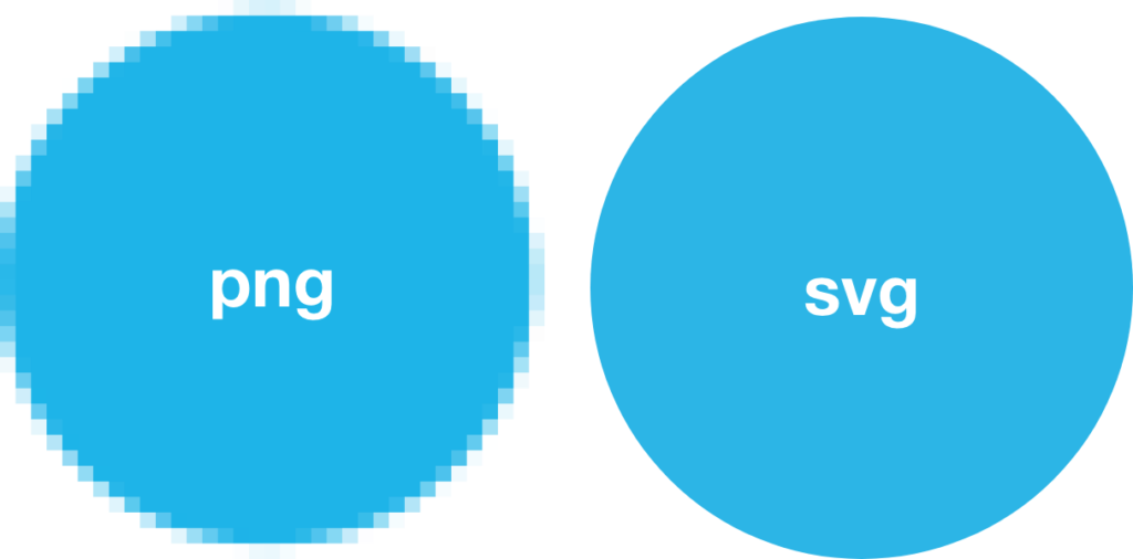
Bitmap visuals have a fixed size and resolution that is based on the number of pixels, but SVG is a vector graphic that allows developers to take them and use them in any platforms, such as Android Studio, to create vector drawables that they can insert into their codes.
For example, if we have a 70×70 px bitmap image, it will be smaller on high-density screens to compare with low-density screens. Conversely, SVG will look at the best quality and shapes in any screen with no limit of size or density.
Creating bitmap images in the highest resolution will be a problem for Android devices that require more time of designers and developers to make it look good in all screen sizes. Also, this will lead applications to use more CPU and memory than normal usages, which will reduce the friendliness of the user experience.
What is Density?
Density is about how many pixels have been physically used into a 1in x 1in area. PPI (pixels-per-inch) is the measurement unit of density in displays like phones, tablets, and monitors. Designers and developers should know how density works. If a designer designs website wireframes (or mockups) in 1x density, the development will be easier likewise. If there are bitmaps in design, export them into 5 different sizes to make sure they will look sharp on all devices with different screen densities.
Logical Density Buckets for Web Apps (Hybrid Apps)
Logical density buckers are created by Android to make exporting images easier. Each phone screen has a different size and density aspect ratios and resolutions. With LDB, designers should just think of 6 different groups of screens and densities. In these 6 groups, the low-density bucket (smaller than 120 DPI) is not very often to use these days. When we design a hybrid app, we could follow this method to make it easier for designers and developers.
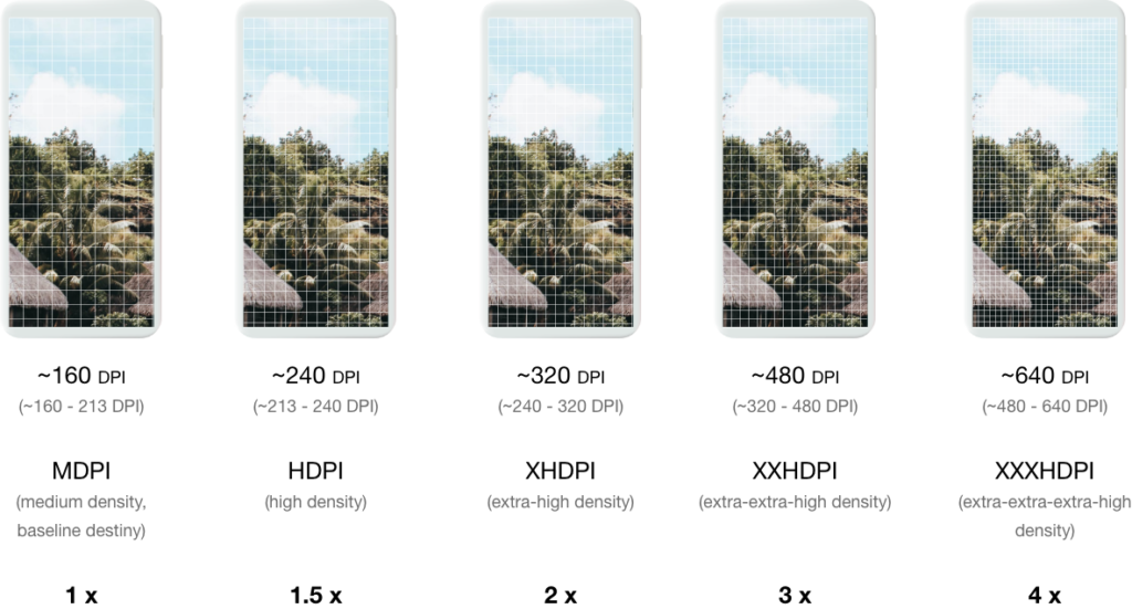
There are 5 different buckets:
Medium density bucket = ~160 DPI = 1x or 100%
High density bucket = ~240 DPI = 1.5x or 150%
Extra-high density bucket = ~320 DPI = 2x or 200%
Extra-extra-high density bucket = ~480 DPI = 3x or 300%
Extra-extra-extra-high density bucket = ~640 DPI = 4x or 400%
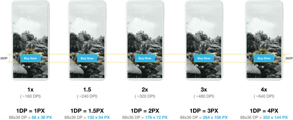
As we see in the image above, all the “Buy Now” buttons appear in the same physical sizes on all screens by keeping the amount of DPs (88×36). This size will take spaces on each screen by increasing base on screen density.
Retina Display Resolution Design
Some users (mostly Apple!) might have hi-res smartphones and the Retina iMacs or MacBooks. There then needs to be consideration in the web & mobile designs for them, as these displays are built with a group of multiple pixels into the same physical size. This makes content sharper if it has been designed well.
Nowadays, some screens have 3x sizes that make designers be safe by designing and exporting images with 3x sizes. This size of images might increase the load time of the web site. One of the solutions for this will be using SVG formats for all visuals, which means the design should be designed visually in vector to avoid this load time. Unfortunately, in some matters, we can’t skip exporting in png. For example, an image of the product usually could not be in vector format, but icons, backgrounds or some animations could be in vector and SVG format.
As I mentioned, SVG visuals will keep the quality in any scales, so the designer doesn’t need to export a big SVG icon to make sure it will appear sharp.
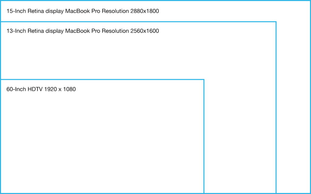
Retina displays have different resolutions and sizes as mentioned in the below image.
Conclusion
In the last decade, designing responsive websites has become a mandatory requirement in the market. As a designer or developer, you should understand the concept of responsive design and how it works. Using grids or any frameworks like Bootstrap or Google Material design will help to structure features/elements in a page neatly and allow it to be flexible to different screen sizes and resolutions.
When we talk about screen sizes, we can’t avoid any of those. If we design for Android hybrid applications or any of websites for small displays, we should not design specifically for each, but by understanding necessary measurements (PPI and DPI), you do not need that much number of screen designs or exported visuals.
Furthermore, Retina displays are a different story because of multiple pixels (in 1-inch x 1-inch), as they have different resolutions that require a designer to think of the tripled size of images and layout. Notwithstanding the different sizes of visuals, designers can create vector images to avoid having too many of the same visual for different screens due to the constant quality of vector visuals in any screen size and resolution, could be the best option to create some assets like icons, illustrations and maybe backgrounds. SVG is a design format that developers can work on.
With responsive web design, we will able to custom solutions for a wider range of users and devices for a better user experience. A website could be designed for a specific display size or resolution, howbeit people use mobile devices compared to desktops and laptops to have access to the internet. Therefore, the website should look great and work well on tablets and smartphones as well as laptops and desktops.
Responsive design truly is a powerful approach that allows uniformity and seamlessness, especially in a time where our consumers are constantly switching between their iPhone to their laptop to their tablet to… whatever other devices they might have. Know it, embrace it, love it!